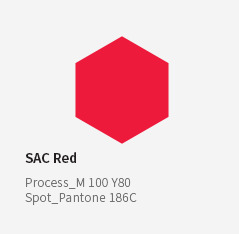
With its strong visual impact,
red represents SAC's
proactive and challenging spirit,
as well as the passion and artistic energy of its artists.


> About > About SAC > Brand Identity > Overview
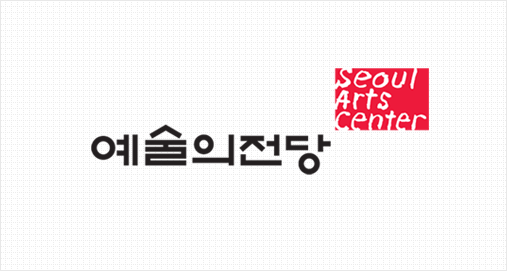
Marking its 25th anniversary in 2013, SAC developed its own corporate identity (wordmark),
combining Korean and Roman characters to reflect its status
as a world-class arts complex and its close connection with the public.
With its strong visual impact,
red represents SAC's
proactive and challenging spirit,
as well as the passion and artistic energy of its artists.
The logotype is composed of a solid, Korean-based design
that reflects SAC’s 25-year history,
paired with a more emotional, handwritten English counterpart.
This visual motif expresses a dynamic space filled with passion
and excitement, where art and the public come together.
The margins and cut-out elements of the motif represent
an open environment where audiences can engage
with and connect to the arts.